


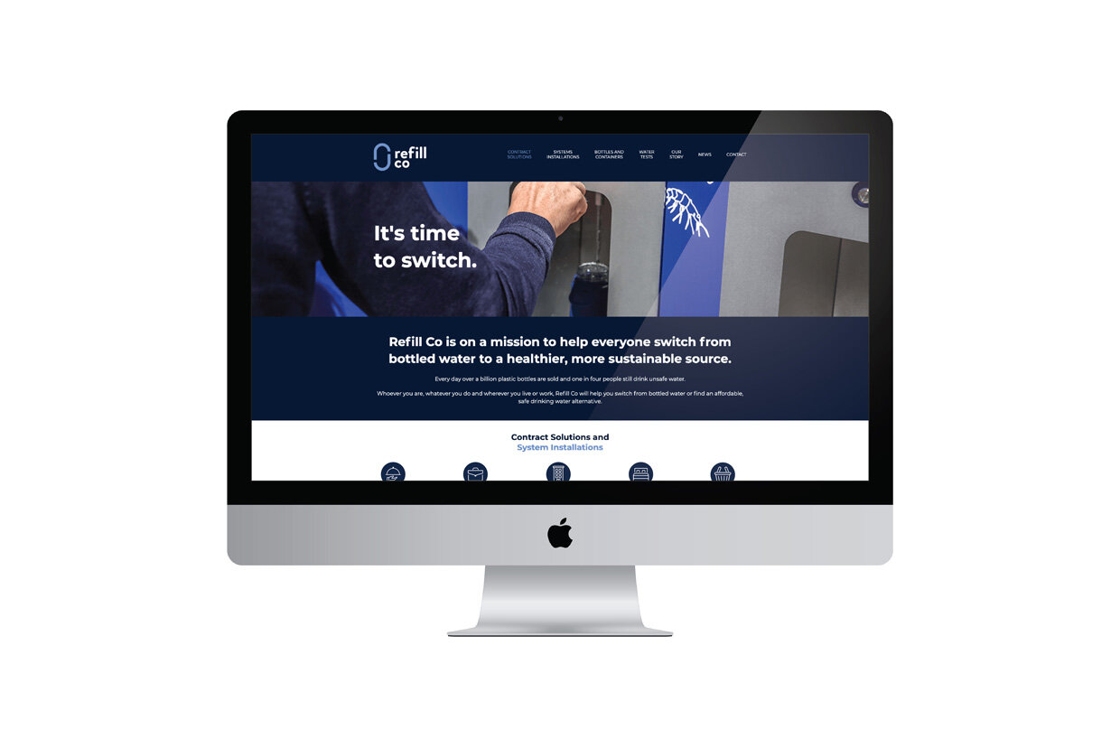
Refill Co is on a mission to get consumers and businesses to switch from bottled water to a refill lifestyle and reduce unnecessary plastic waste in the process. The company has a range of innovative products which cater to different segments of the market. Our task was to create the brand identity and website for Refill Co and design logos for its respective products: Aquifer, Cube, and Waterpod.
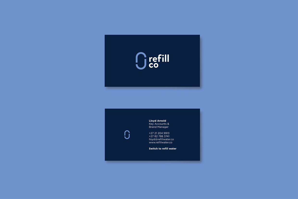
For the overarching brand, Refill Co, the logo icon represents the cycle of water and the infinite nature of reusing. It also signifies the process of creating pure drinking water from non-potable sources. The icon design is made of an ‘r’ for Refill Co and the rounded design suggests the flow of water. The light blue and white logo on a flooded navy background serves to reinforce the scale of the issue and the greater mission behind the brand.
For the various products, Aquifer, Cube, and Waterpod, our approach was to treat the logos as part of a greater family to create consistency and allow the different brands within the portfolio to live together in a considered way. Each of the resulting logos uses a similar type treatment and has a unique letter within the name to highlight the respective product.